Meet Giulia
Your AI Dashboard Assistant
Create complete analytics dashboards using natural language. Ask a question, get a dashboard in seconds.

From Question to Dashboard in Seconds
Traditional dashboards require SQL, configuration, and time. Giulia transforms how you explore your data.
Traditional Approach
With Giulia
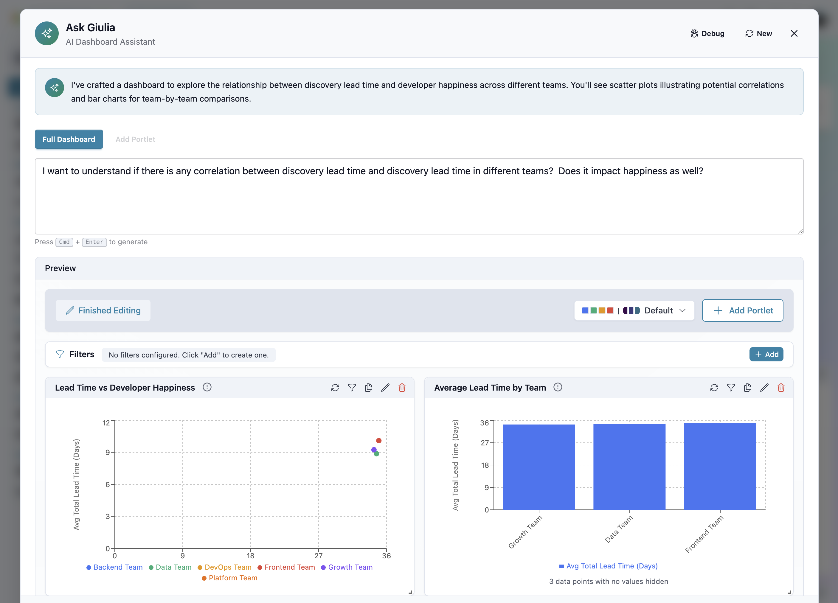
"I want to understand if there is any correlation between discovery lead time and developer happiness across different teams"
How Giulia Works
Ask a Question
Type your analytics question in natural language. Giulia understands context, relationships, and intent.
Dashboard Generated
Giulia selects the right cubes, dimensions, measures, and chart types to answer your question visually.
Edit & Save
Fine-tune the generated dashboard, add filters, adjust visualizations, then save and share with your team.
Giulia's Capabilities
Powered by Drizzle-Cube's semantic layer with full access to all your analytics
Natural Language Queries
Ask questions in plain English. No SQL, no query builders, no learning curve.
Smart Visualization
Giulia automatically selects the best chart types for your data: scatter plots, bar charts, line graphs, and more.
Full Dashboard Generation
Get complete dashboards with multiple portlets from a single query. Not just one chart - the whole picture.
Drizzle-Cube Powered
220+ dimensions and 300+ measures across 19 analytics cubes at Giulia's fingertips.
Fully Editable
Every dashboard Giulia generates is fully editable. Add portlets, change filters, adjust visualizations.
Team Collaboration
Save dashboards and share insights with your team. Everyone benefits from AI-powered analytics.
What Can You Ask?
Giulia understands questions across Discovery, Delivery, AI productivity, and more
"Show me research validation rates by team over the last quarter"
Creates: Line chart with team breakdown, trend analysis
"Which teams have the highest lead time and why?"
Creates: Bar chart with team comparison, breakdown by bottleneck stage
"Compare AI provider effectiveness across task types"
Creates: Heatmap or grouped bar chart with provider × task breakdown
"Is there correlation between developer happiness and deployment frequency?"
Creates: Scatter plot with trend line, team color coding
"Show all DORA metrics for backend team this month"
Creates: KPI cards + trend charts for all 4 DORA metrics
"Which SPACE dimensions are lowest and trending down?"
Creates: Radar chart + trend analysis with alert highlights
Part of the Analytics Suite
Giulia works alongside our full custom analytics platform. Start with AI, go deep with manual tools.
Giulia queries the same 220+ dimensions and 300+ measures as the visual builder
Switch to manual mode to fine-tune any dashboard Giulia creates
Quick insights with Giulia, precision control with the full analytics suite
Ask Giulia Your First Question
Transform how you explore analytics. Natural language to complete dashboards in seconds.