Engineering KPIs That Actually Matter
Most engineering KPI lists focus only on output. Here's a curated set that includes discovery, developer experience, and team health—because shipping fast means nothing if you're shipping the wrong things.
Search for “engineering KPIs” and you’ll find dozens of lists. They’re all variations of the same theme: deployment frequency, lead time, velocity, throughput, lines of code, PR counts.
These metrics answer one question: How fast are we shipping?
They don’t answer equally important questions:
- Are we shipping the right things?
- Can we sustain this pace?
- Is the team healthy?
- Are customers getting value?
This guide presents a more complete set of engineering KPIs—organised not just by what’s easy to measure, but by what actually matters for engineering success.
The Problem with Output-Only KPIs
Traditional engineering KPIs share a common bias: they measure output. Things that can be counted. Activity that leaves traces in your tools.
This creates blind spots:
Blind Spot 1: Discovery Work
Before code gets written, teams should be researching, validating, and planning. This work doesn’t produce commits or deployments—but it determines whether what you build has any value.
Research shows that 70-80% of product ideas fail to deliver expected value. Discovery work reduces that failure rate. But if you only measure delivery, you’re incentivizing teams to skip the work that makes delivery worthwhile.
Blind Spot 2: Developer Experience
A team hitting high velocity while burning out looks the same in delivery metrics as a team hitting high velocity sustainably. Output metrics don’t distinguish between healthy performance and borrowed time.
65% of engineers experienced burnout in the past year. Many of them were on “high-performing” teams by traditional metrics.
Blind Spot 3: Quality Beyond Bugs
Change failure rate captures production incidents, but it doesn’t capture:
- Technical debt accumulation
- Code maintainability decline
- Architecture erosion
- Documentation gaps
Teams can maintain low failure rates while building fragile, hard-to-maintain systems. The problems show up later.
Blind Spot 4: Customer Value
High deployment frequency tells you code is reaching production. It doesn’t tell you customers are getting value. You can deploy constantly while user satisfaction declines.
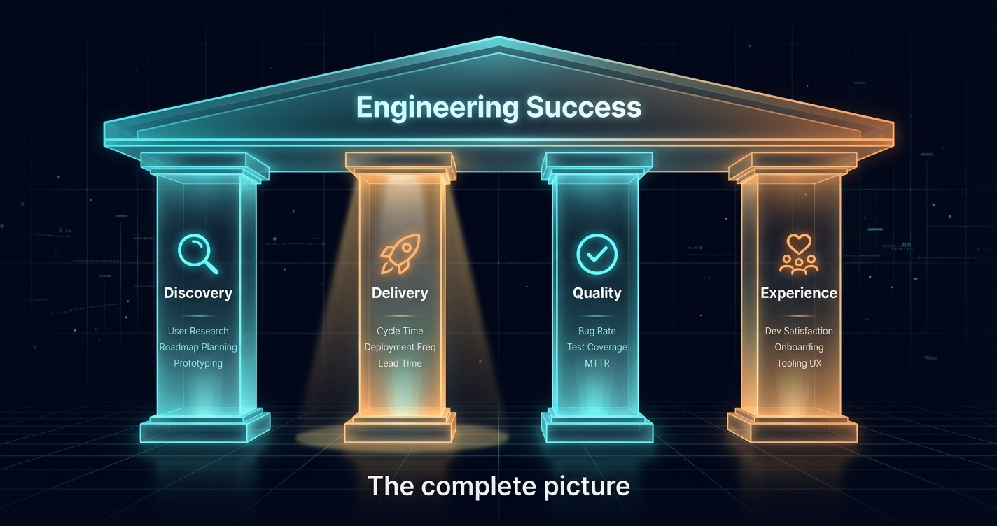
A Better Framework: The Four Pillars
Instead of organising KPIs by what’s measurable, organise by what matters. We use four pillars:
- Discovery: Are we building the right things?
- Delivery: Are we building things efficiently?
- Quality: Are we building things well?
- Experience: Is the team healthy and sustainable?
Each pillar needs representation in your KPI set. Optimising one at the expense of others creates dysfunction.
Pillar 1: Discovery KPIs
Discovery KPIs measure whether teams are validating what they build before they build it. These are the metrics most lists completely ignore.
Customer Touchpoint Frequency
What it measures: How often teams interact directly with customers.
Why it matters: Teams that talk to customers regularly build better products. Teresa Torres recommends weekly customer touchpoints as the standard.
How to track: Count customer interviews, feedback sessions, usability tests per team per month.
| Rating | Touchpoints per Month |
|---|---|
| Excellent | 4+ (weekly) |
| Good | 2-3 |
| Needs improvement | 1 |
| Poor | 0 |
Validation Rate
What it measures: What percentage of features were validated before building?
Why it matters: Unvalidated features are expensive guesses. Validation dramatically improves success rates.
How to track: Tag features as “validated” or “unvalidated” based on whether research preceded development. Calculate percentage.
Discovery-to-Delivery Ratio
What it measures: How much effort goes into discovery versus delivery?
Why it matters: Teams that skip discovery build faster but waste more. The ratio indicates whether discovery is prioritised or squeezed out.
How to track: Time tracking or story point allocation to research/discovery versus implementation work.
Target: 20-30% discovery, 70-80% delivery is common for product teams. Purely execution teams may be lower.
Feature Adoption Rate
What it measures: What percentage of shipped features get meaningful adoption?
Why it matters: This is the ultimate validation metric—did customers actually want what you built?
How to track: Define “adoption” for each feature type. Measure usage 30/60/90 days post-launch.
| Rating | Adoption Rate |
|---|---|
| Excellent | >70% |
| Good | 50-70% |
| Needs improvement | 30-50% |
| Poor | <30% |
Pillar 2: Delivery KPIs
These are the traditional engineering metrics—but contextualised within the broader picture.
Deployment Frequency
What it measures: How often you release to production.
Why it matters: Frequent deployment enables faster feedback, smaller changes, and reduced risk.
Benchmarks (from DORA):
| Level | Frequency |
|---|---|
| Elite | On-demand (multiple times/day) |
| High | Daily to weekly |
| Medium | Weekly to monthly |
| Low | Monthly or less |
Caveat: High deployment frequency is only valuable if you’re deploying valuable things. This metric needs discovery context.
Lead Time for Changes
What it measures: Time from code commit to production.
Why it matters: Short lead times enable rapid iteration and feedback.
Benchmarks:
| Level | Lead Time |
|---|---|
| Elite | <1 hour |
| High | 1 day - 1 week |
| Medium | 1 week - 1 month |
| Low | >1 month |
Cycle Time
What it measures: Time from work started to work completed.
Why it matters: More comprehensive than lead time—includes the full work cycle, not just post-commit.
How to track: From issue moved to “in progress” to issue moved to “done.”
Flow Efficiency
What it measures: What percentage of cycle time is active work versus waiting?
Why it matters: Most teams have flow efficiency under 15%. Understanding where time goes reveals improvement opportunities.
Formula: Active Work Time / Total Cycle Time × 100%
Target: 40%+ is excellent. Most teams are below 20%.
Throughput
What it measures: Volume of work completed per time period.
Why it matters: Combined with cycle time, shows capacity and predictability.
How to track: Stories/features/issues completed per sprint or month.
Caveat: Throughput without quality context is dangerous. High throughput of buggy features is worse than lower throughput of solid ones.
Pillar 3: Quality KPIs
Quality metrics go beyond “did it break in production” to capture long-term code health.
Change Failure Rate
What it measures: Percentage of deployments causing incidents.
Why it matters: Core stability indicator. High rates indicate quality problems.
Benchmarks:
| Level | Failure Rate |
|---|---|
| Elite | 0-5% |
| High | 5-10% |
| Medium | 10-15% |
| Low | 15%+ |
Mean Time to Recovery (MTTR)
What it measures: How quickly you recover from failures.
Why it matters: Failures happen; recovery speed determines impact.
Benchmarks:
| Level | MTTR |
|---|---|
| Elite | <1 hour |
| High | <1 day |
| Medium | 1 day - 1 week |
| Low | >1 week |
Rework Rate
What it measures: How often you have to re-do work that was “done.”
Why it matters: High rework indicates quality issues not caught earlier. The 2025 DORA report added this as a fifth metric.
How to track: Track bug fixes, hotfixes, and reverts as percentage of total work.
Target: Under 15% is healthy. Over 25% indicates systemic problems.
Technical Debt Ratio
What it measures: How much time goes to debt reduction versus new work?
Why it matters: Accumulating debt eventually slows everything down.
How to track: Tag work as “new feature,” “maintenance,” or “debt reduction.” Calculate ratios.
Guidance: 15-20% of capacity on debt reduction is typical for healthy teams. 0% means debt is accumulating. Over 30% suggests serious catching up.
Test Coverage Trend
What it measures: Is test coverage increasing, stable, or decreasing?
Why it matters: The trend matters more than the absolute number. Declining coverage indicates quality slippage.
How to track: Measure coverage percentage over time. Focus on trend line.
Code Review Quality
What it measures: How thorough are code reviews?
Why it matters: Rubber-stamp reviews don’t catch problems. Quality reviews are a key defense.
How to track: Comments per PR, review time, reviewer distribution, bug escape rate for reviewed code.
Pillar 4: Experience KPIs
Experience metrics capture the human dimension—team health, sustainability, and satisfaction.
Developer Satisfaction (eNPS)
What it measures: Would developers recommend their team as a place to work?
Why it matters: Satisfaction predicts retention, productivity, and quality.
How to track: Regular surveys. “On a scale of 0-10, how likely are you to recommend working on this team?”
Formula: % Promoters (9-10) − % Detractors (0-6)
| Rating | eNPS |
|---|---|
| Excellent | 50+ |
| Good | 20-50 |
| Needs improvement | 0-20 |
| Poor | Negative |
Sustainable Pace Score
What it measures: Can the team maintain their current pace indefinitely?
Why it matters: High velocity that burns people out is not high performance.
How to track: Survey: “I can maintain my current work pace indefinitely” (1-5 scale).
Target: 4.0+ average indicates sustainable pace. Below 3.0 indicates burnout risk.
Tool & Process Friction
What it measures: How much friction do developers experience daily?
Why it matters: GetDX research found developers lose a full day per week to inefficiencies.
How to track: Survey: “I have the tools and processes I need to be productive” (1-5 scale).
Learning & Growth
What it measures: Are developers learning and developing skills?
Why it matters: Growth opportunity is a top driver of retention and engagement.
How to track: Survey: “I’m learning and growing in my role” (1-5 scale).
After-Hours Work
What it measures: How much work happens outside normal hours?
Why it matters: Consistent after-hours work indicates capacity problems or cultural issues.
How to track: Analyse commit timestamps, message activity, or survey for self-reported patterns.
Target: Occasional after-hours work is normal. Consistent patterns indicate problems.
Vacation Usage
What it measures: Are people actually taking time off?
Why it matters: Unused vacation indicates burnout risk and unsustainable pace.
How to track: Track vacation balances and usage rates.
Target: 80%+ of allocated vacation should be used annually.
Putting It Together: A Balanced Scorecard
Here’s a practical KPI set that covers all four pillars without overwhelming:
Essential (Track Weekly/Monthly)
| Pillar | KPI | Target |
|---|---|---|
| Discovery | Feature Adoption Rate | >50% |
| Delivery | Lead Time | <1 week |
| Delivery | Deployment Frequency | Daily+ |
| Quality | Change Failure Rate | <10% |
| Quality | Rework Rate | <15% |
| Experience | Developer Satisfaction | >20 eNPS |
| Experience | Sustainable Pace | >4.0/5.0 |
Important (Track Quarterly)
| Pillar | KPI | Target |
|---|---|---|
| Discovery | Customer Touchpoints | 4+/month |
| Discovery | Validation Rate | >60% |
| Delivery | Flow Efficiency | >25% |
| Quality | Technical Debt Ratio | 15-20% |
| Experience | After-Hours Work | Minimal |
| Experience | Learning & Growth | >4.0/5.0 |
Contextual (Track As Needed)
- Throughput (for capacity planning)
- Cycle time (for process improvement)
- Test coverage trend (for quality initiatives)
- Reviewer distribution (if reviews are bottlenecked)
The Correlation Insight
The real power comes from correlating across pillars. Look for patterns like:
High delivery + low discovery = waste risk You’re shipping fast, but are you shipping the right things? Check feature adoption.
High delivery + low experience = sustainability risk Fast shipping driven by unsustainable effort. Check burnout indicators.
High quality + low delivery = optimization opportunity You’re being careful but slow. Look for process friction.
Low experience + declining quality = crisis brewing Unhappy team producing declining work. Address root causes urgently.
What to Avoid
Vanity Metrics
- Lines of code (incentivizes bloat)
- Commits per day (incentivizes meaningless commits)
- Story points (gameable and team-specific)
- Meetings attended (activity ≠ productivity)
Metrics Without Context
- Velocity without quality
- Deployment frequency without adoption
- Lead time without sustainability
- Throughput without customer value
Individual Performance Metrics
The DORA team explicitly warns against using metrics to compare individuals. Software development is collaborative—individual metrics break collaboration.
Implementation Advice
Start Small
Don’t try to measure everything immediately. Pick 3-5 KPIs that address your biggest blind spots.
Lead with Experience
If you’re adding new metrics, start with developer experience surveys. They’re non-threatening, provide immediate insight, and signal that you care about the team.
Make Metrics Visible
KPIs that only leadership sees don’t drive improvement. Teams need visibility into their own metrics to self-correct.
Review Regularly
KPIs need discussion, not just dashboards. Regular review sessions turn data into action.
Iterate
Your KPI set should evolve. As you address one problem, shift focus to the next constraint.
The Bottom Line
The engineering KPIs that matter aren’t just the ones that measure output. They’re the ones that tell you:
- Are you building the right things? (Discovery)
- Are you building them efficiently? (Delivery)
- Are you building them well? (Quality)
- Can you keep doing this? (Experience)
Most organisations over-index on delivery metrics because they’re easy to measure. The result: teams that ship fast but ship the wrong things, or ship fast but burn out, or ship fast but accumulate debt.
A balanced KPI set across all four pillars gives you the complete picture—and the ability to optimise for sustainable, valuable delivery rather than just speed.
Track What Matters
GuideMode provides KPIs across all four pillars—discovery metrics, delivery analytics, quality signals, and developer experience surveys—in one platform. See the complete picture of engineering performance.